 Drum&BassArena 2013 is out today! We’ve been shouting about it with a whole series of interviews… For this one we thought we’d celebrate one of the most significant aspects of any album that often gets overlooked and under-propped: The artwork!
Creating a strong branded identity that cuts through the competition and instantly conjures up scene iconography is the holy grail for any designer. And with our trademark yellow and black ‘four block’ motif, David Bailey’s design has certainly given Drum&BassArena a distinctive brand tattoo that’s been with us since 1998.
We’ve been working with David ever since and, proof of the original logo’s strength, he’s only tweaked it twice since in its 15 year history. We gave him a call to find out how the design came about, what his favourite designs for Drum&BassArena have been… And what it will look like in 100 year’s time!
When you first started working with Drum&BassArena what was your brief, how did you arrive at the classic four-block logo, and why yellow and black?
The meaning behind the 4 blocks has been much speculated upon over the years, so let’s clear this up once and for all…
I remember setting out to create an identity which deliberately went against the grain of the D&B/jungle design style of the time. Back then it was all ganja leaves, graffiti and booming speakers which, to me, felt recycled and patronising when applied to such a groundbreaking form of music. Hence me wanting D&BA to look modern, different, memorable.
Drum&BassArena, first and foremost, is a website: An online tool from which to learn and interact at the push of a button, so to speak. The blocks represented these “buttons”, like the navigation tabs at the top of the website.
The Tonka toy-inspired yellow & black colours complimented the blocky shapes, giving the logo an appropriately industrial yet toy-like aesthetic. That’s how the logo was born, and how it remains to this day.
Run us through the various remixes the logo and branding has had over the years…
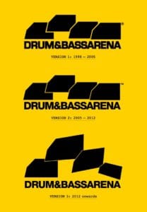
This shows the two tweaks the logo has undergone in its 15 year history…
• The original logo, designed in 1998, uses the font Square 721 (Bold).
• In late 2004 we changed the font to the more flexible/timeless Helvetica (85 Heavy).
• In 2012 we made the blocks more dynamic. This was derived from a 3D treatment we’d done for the ‘Anthology’ compilation in 2010.
An early Drum&BassArena event flyer.
The Helvetica logo first appeared on the fourth Drum&BassArena compilation mixed by DJ Zinc. I really like this cover. (RIP React Records)
 The ‘Anthology’ compilation cover.
The AMEN! t-shirt is a recent example of us referencing the brand’s sloganeering design roots… The Amen break being one of the most famous breakbeats in D&B history.
Of all the artwork and design you’ve created for DNBA, what’s your personal favourite?
My favourite designs were the early flyers, posters and t-shirts which simply featured yellow and black text stating what each item was.
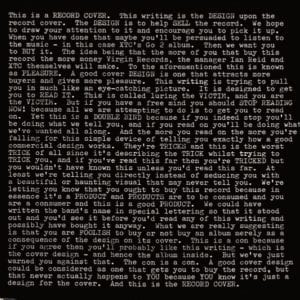
This ‘Ronseal’ design approach became something of a trend during the late nineties/early noughties, adopted by numerous design and advertising agencies, suggesting Drum&BassArena’s identity had some cultural impact at the time. However, I don’t claim to be the originator of this style. I was inspired by an album cover by XTC called Go 2, designed by seventies design legends Hipgnosis.
Care to share any insight or tips for designers trying to make it in the music industry?
Design for music industry has changed dramatically over the years. Online file sharing has depleted music sales, thus most design now exists on a small iTunes-friendly digital canvas. That’s not to say it’s any less exciting. Just not as profitable.
My advice for anyone keen to design for music would be to befriend local bands, musicians, DJs and club promoters, as they often need design. That’s how I started.
Finally please give us an idea of what Drum&BassArena imagery will look like in 2113…
It will be beamed from our new design studio somewhere in outer space directly into your brains! But rest assured, it’ll still be yellow & black.
Check out David’s website: Kiosk
Drum&BassArena 2013 is out now!
Grab it today on Drum&BassArena, iTunes or a very special t-shirt and CD bundle!


